
Understanding Population Data
Helpful information to understand population data around the world


Following the recent release of population data from the Census Bureau, a number of articles have come out on the topic. In lieu of including them in my weekly Curated Compositions, I wanted to highlight them separately and provide some context. In this post I’ll discuss the Dallas Cowboys, the birds and the bees, why men die before women, immigration, and more.
Size
As of right now, the human population on earth is 8,074,399,487…give or take a few.
Think about that—8 billion people.
To help visualize that number of people, consider AT&T Stadium in Arlington, Texas, home of America’s Team, the Dallas Cowboys. AT&T Stadium can seat 80,000 people, and including parking, covers about 70 acres.
We would need to have 100,000 stadiums, at 80,000 seats each, to be able to seat the entire population of the earth.
And, at 70 acres apiece, we’d need 7,000,000 acres for all those stadiums. Thankfully, Texas is over 171,000,000 acres in size, so we’d have plenty of room, but traffic would be a nightmare (even more than it already is).

It’s taken us a while to reach that population size, given pneumonia, tuberculosis, plagues, and other such causes of death. The biggest increases in population size have come in just the last two hundred years, as we’ve more than doubled our life expectancy.
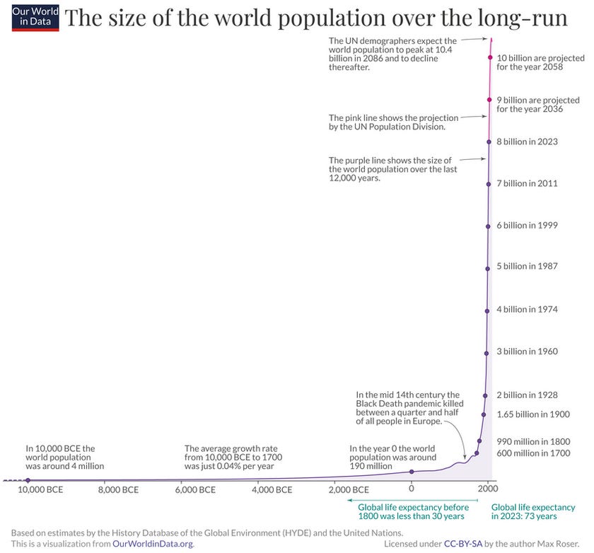
Estimates are that over 109 billion humans lived before us; which, when we add the 8 billion people alive today, means that 117 billion humans have populated the earth over time. However, it should be noted that, “As a general rule, the confidence of estimates on historical world population decreases for the more distant past” (an important caveat).
Doing some quick math (117 divided by 8) reveals that those people alive today represent about 15% of the total number of people who have ever lived.

With that background, let’s turn our attention to current populations across the earth by looking at the 50 highest populated countries.
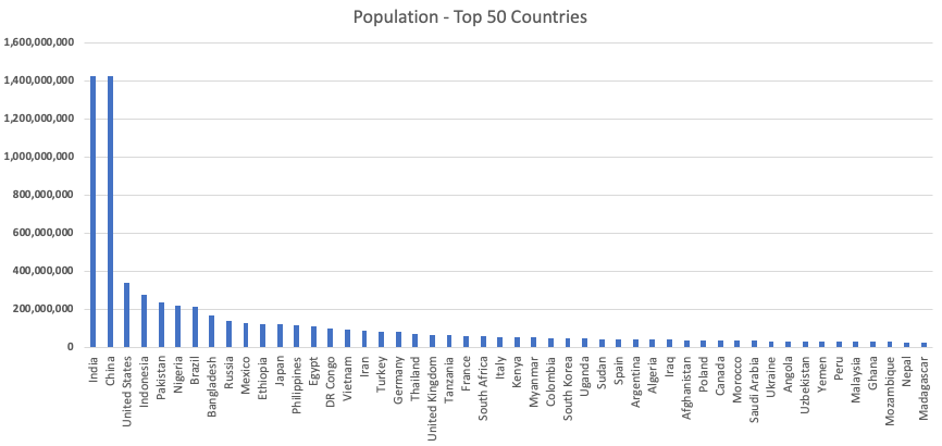
You’ll note the current US population is roughly 340 million, while India and China are around 1.4 billion—more than four times that of the US.
Also note that Russia, at 144 million, is less than half that of the US—this should reassure those of you who fear Russia invading the US by sending troops onto our shores…or parachuting down like in Red Dawn.
But, this is just a snapshot in time; there are really many more factors that must be considered when looking at population.
Age
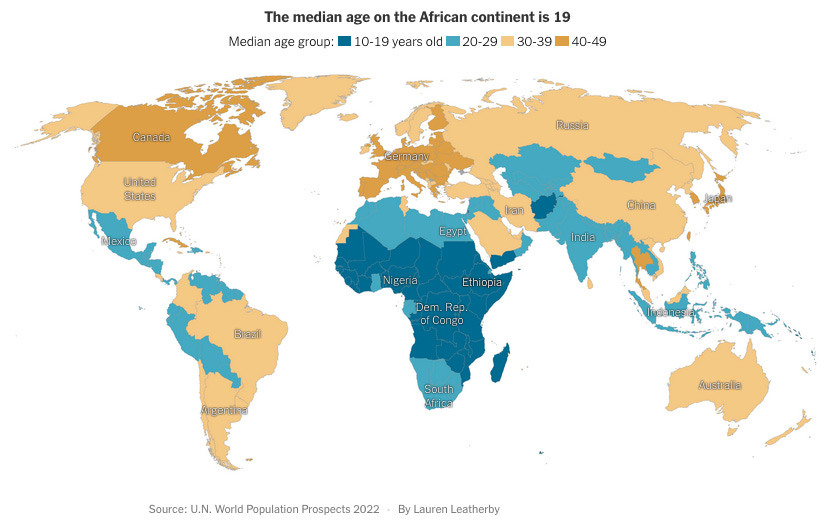
The following chart shows the 50 countries with the lowest average population age; it also includes the US for comparison.
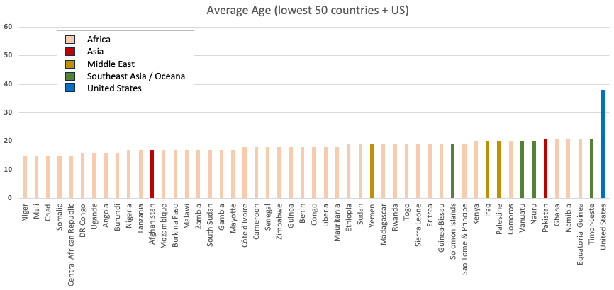
The biggest takeaway from this chart is that the continent of Africa has a disproportionate number of countries with a very young population.
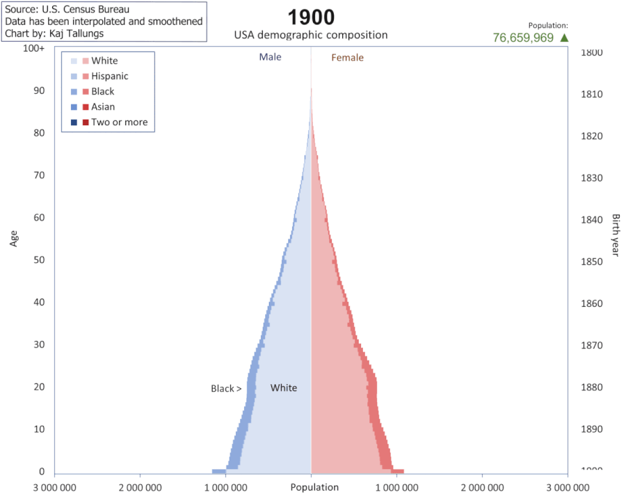
While average age tells you a story, it doesn’t tell you the whole story. To dig deeper, we can look at population pyramids, like the one below, to see the population in five-year cohorts. The below pyramid is for the world at large.
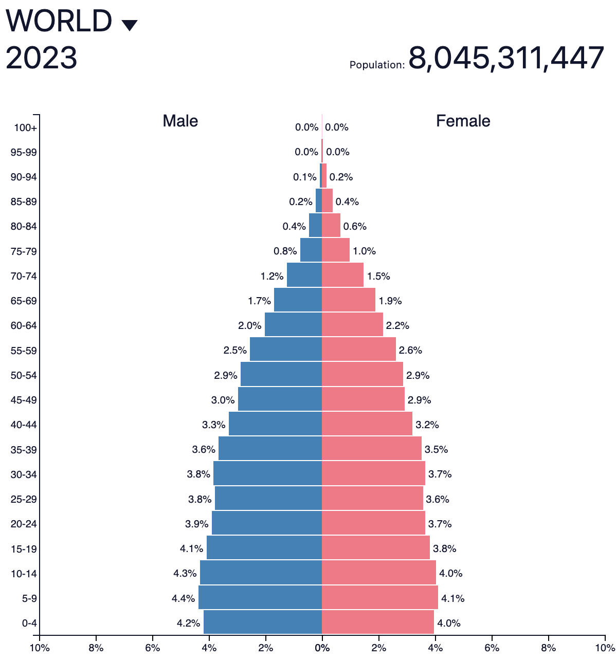
As expected, there are more younger people and fewer older people. This sounds obvious, but it’s a really important fact to acknowledge. Because mothers don’t birth five-year-olds or 20-year-olds (thank goodness!), as a cohort moves from one row up to another (say, from ages 0-4 up to ages 5-9), it will never get bigger, it will just shrink due to deaths.
The implications to future population size are borne out in the following diagrams that show you typical shapes of population pyramids.
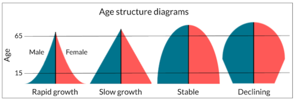
In a closed system, such as the world at-large, change to a population occurs through births and deaths. Because there are no humans outside the earth (as far as we know), the age cohorts will not grow larger as they grow older.
However, in an open system, such as countries, change occurs through births, deaths, and migration. And in these open systems, cohorts can grow, or shrink, due to migration in, or out, of the countries. Demography, the study of populations, pays special attention to these birth rates, death (mortality) rates, and migration rates.
The Birds and the Bees
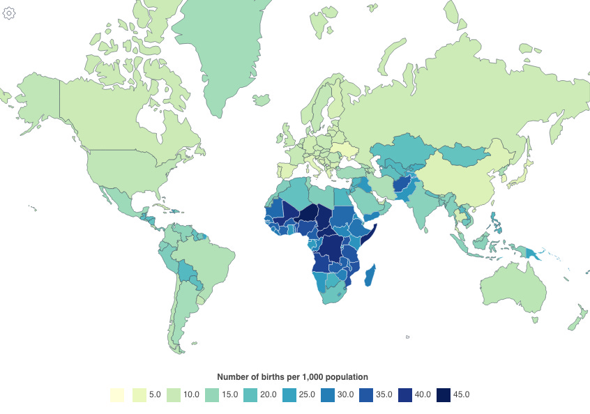
I’ll spare you the explanation of human procreation (you can watch this video, if you need); instead let’s just jump ahead to the post-birthing part. This chart from World Population Review provides a snapshot of current birth rates:
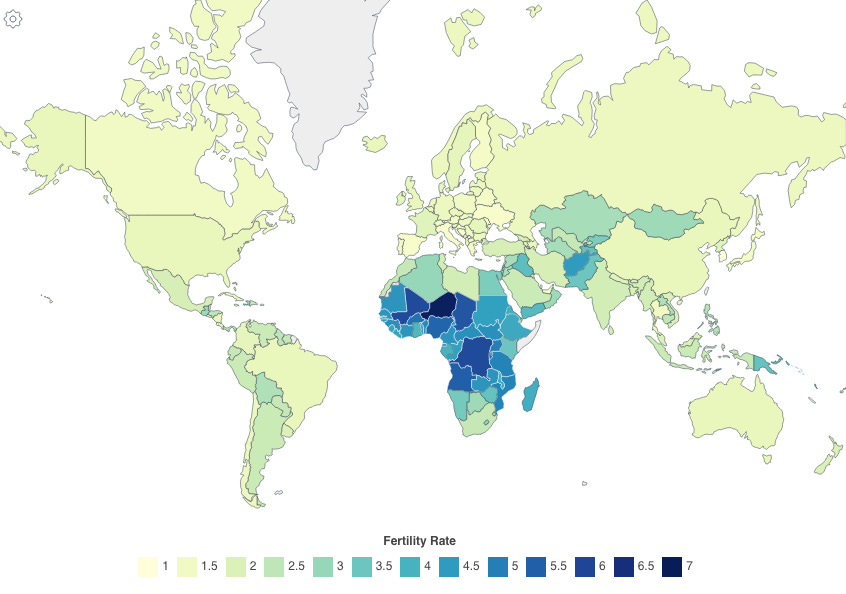
While birth rate measures the number of children born per 1,000 people, fertility rate measures the number of children born to a woman of childbearing age. The chart below from World Population Review shows current fertility rates. You’ll notice it tracks closely with birth rates, though there are some differences.
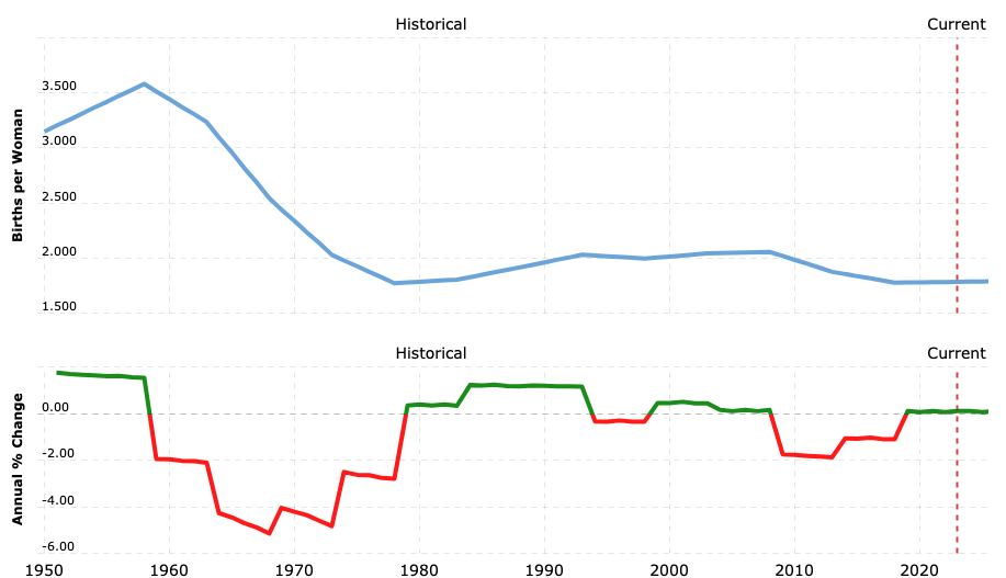
You can see the change in US fertility rates over time in this chart:
Compare that to the fertility rate in Niger, the dark blue shaded country in the map above.
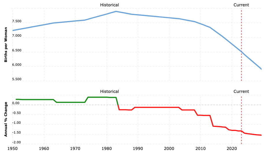
While decreasing, the fertility rate in Niger is still much higher (6.5) than that of the US (1.75).
The population replacement rate, which is the fertility rate needed to maintain a society's population size, is 2.1 children per woman. Why 2.1? Well, it takes two children to replace two parents, and the .1 takes into account children who die before they are able to have children of their own. In reality, this number varies by country based on life-expectancy—some countries may require a larger fertility rate if the life exptancy in that country is low.
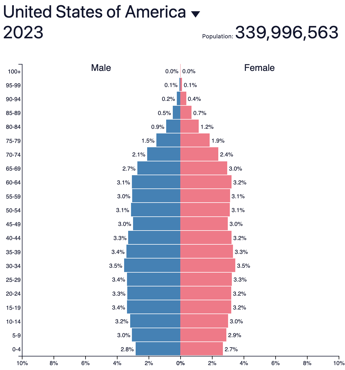
Given that the US has a fertility rate less than 2.1, the US will be unable to maintain its population size on births alone; you can see it in population pyramid below. Note the concerning lower percentages at the younger ages. More on this later.
The increasing or decreasing size of a population have wide-ranging impacts to a country.
Economically, it means there are fewer people working, which results in a lower GDP; and if those fewer people are supporting an ever-growing older population, then further strain is put on an economy and on the populace. Additional impacts of a decling population include lower demand for services and infrastructure, and decline in military strength.
The Young and the Restless
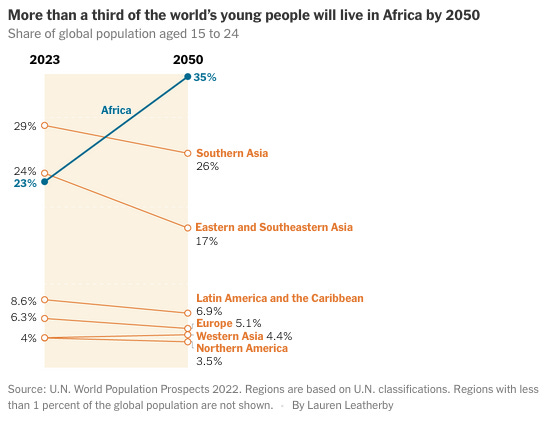
Now, let’s look at the continent of Africa, which is facing a different problem.
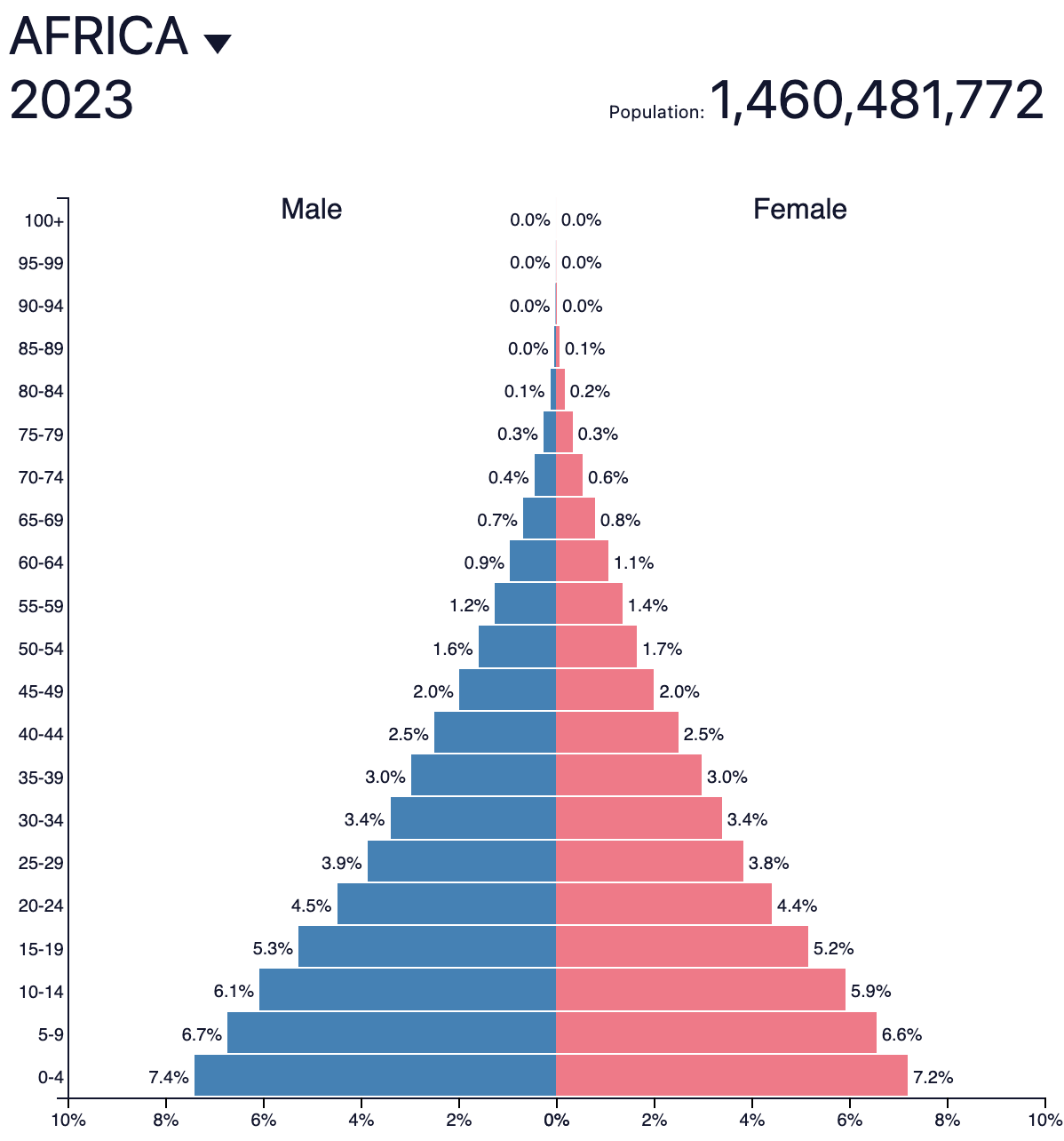
Going back to our age structure diagram, you’ll note this shape reflects rapid growth.
This is what led to the New York Times article, Old Word, Young Africa. The article includes great insights covering peril and potential, culture, jobs, leadership, militants, and more.
Here’s an overview:
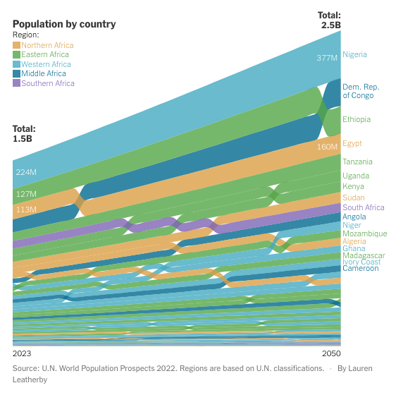
Astonishing change is underway in Africa, where the population is projected to nearly double to 2.5 billion over the next quarter-century — an era that will not only transform many African countries, experts say, but also radically reshape their relationship with the rest of the world. Birthrates are tumbling in richer nations, creating anxiety about how to care for, and pay for, their aging societies. But Africa’s baby boom continues apace, fueling the youngest, fastest growing population on earth. In 1950, Africans made up 8 percent of the world’s people. A century later, they will account for one-quarter of humanity, and at least one-third of all young people aged 15 to 24, according to United Nations forecasts. The median age on the African continent is 19. In India, the world’s most populous country, it is 28. In China and the United States, it is 38. The implications of this “youthquake,” as some call it, are immense yet uncertain, and likely to vary greatly across Africa, a continent of myriad cultures and some 54 countries that covers an area larger than China, Europe, India and the United States combined. But its first signs are already here.
The article also includes some very informative charts:
…some concerns:
“In the 1970s and 1980s, when China, South Korea and Japan were the engines of population growth, their factories were filled with young people producing clothes, cars and TVs. It made them rich and lifted hundreds of millions out of poverty. Africa is poorly positioned to repeat that feat. Other than South Africa and a handful of countries in North Africa, most of the continent has failed to industrialize. In fact, it is losing ground: Africa’s share of global manufacturing is smaller today than it was in 1980. Infrastructure is an obstacle. Six hundred million Africans, or four in 10, lack electricity. An average American refrigerator consumes more power in a year than a typical person in Africa. Major roads and railways often lead to the coasts, a legacy of extractive colonialism, which inhibits trade between countries. And the baby boom endures, smothering economic growth. Other regions, like East Asia, prospered only after their birthrates had fallen substantially and a majority of their people had joined the work force — a phenomenon known as the “demographic transition” that has long driven global growth. Britain’s transition took two centuries, from the 1740s to the 1940s. Thailand did it in about 40 years. But in Africa, where birthrates remain stubbornly high — nearly twice the global average — that transition has proved elusive. For legions of jobless and frustrated young Africans, that leaves only one good option: Get out.”
…some observations:
“High birthrates alone do not cause insurgencies. But they are a major accelerant when combined with weak states and deep poverty.”
“Educating girls has an unusually large effect on family size in Africa because it delays the age of marriage and helps young women to space out their children, researchers have found. “It’s a natural kind of birth control,” said Habiba Mohammed, the program’s director.”
…and some hope:
“When the economist Ha-Joon Chang was growing up in South Korea in the 1960s, his country was subjected to the same condescension and racism leveled at many African nations today, he said. It was poor, had just emerged from war, and was seen by American officials as a basket case. A young population was a big part of South Korea’s success, Mr. Chang said. But it took other ingredients, too: visionary leaders, wise policies and education, as well as intangibles like drive, innovation and sheer good fortune, he said. “A lot of things have to work together.”
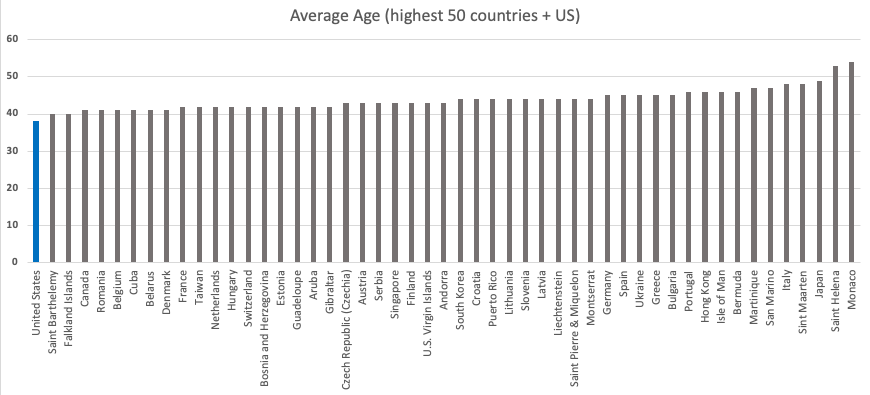
Aging Gracefully
On the other end of the spectrum we have older populations. For comparison, here are the 50 countries with the highest average age, plus the US (I have not color-coded these by continent):
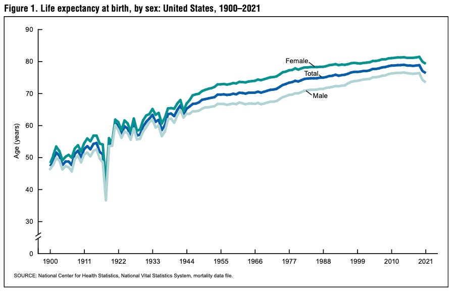
This then brings up different problems—aging populations and death rates. Not only must birth rates be considered, but also life-expectancy (how long people live) must be taken into account.
As reported in the National Vital Statistics Reports,
In 2021, the overall expectation of life at birth was 76.4 years, decreasing 0.6 year from 77.0 in 2020. From 2020 to 2021, life expectancy at birth decreased by 0.7 year for males (from 74.2 to 73.5) and by 0.6 year for females (79.9 to 79.3).
Here, too, we can further slice the data and look at differences in life expectancy by sex. This data is captured in the population pyramids, but I think it’s helpful to look at it separately.
That same data can be graphed to just show the gap between female and male life expectancy.
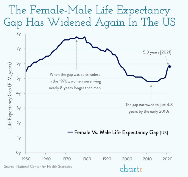
Being a married man, whose wife reads these posts (I think), I will refrain from any jokes as to why men live shorter lives than women; instead I’ll just post this:

(the author may or may not be guilty of doing some variation of one the items above)
In all seriousness, according Harvard Medical School, men die before women becase they tend to: take bigger risks, have more dangerous jobs, die of heart disease more often and at a younger age, be larger than women, commit suicide more often than women, be less socially connected, and void doctors.
You can go here to look up your age and sex to see how many years you have left to live (estimated, of course). The good news is, the longer you live, the longer you’ll probably live…that is, until you don’t. For instance, a male at age 50, will live another 28.33 years, while a male at age 75 will live another 10.46 years.
What this really depends on is how my ladders you stand on or cars you sit under.
A Case for Immigration
The Wall Street Journal expanded on all of these topics with some great insights and infographics:
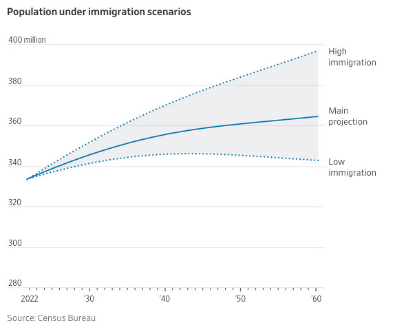
America’s long streak of population growth is expected to come to an end. Census Bureau projections released Thursday show that, under the most likely scenario, the U.S. will stop growing by 2080 and shrink slightly by 2100. It is the first time that the bureau has projected a population decline as part of its main outlook for the coming decades. The only time the U.S. has recorded a population decline was in 1918, when the flu pandemic and deployment abroad of more than one million troops produced a small drop in the estimated population.
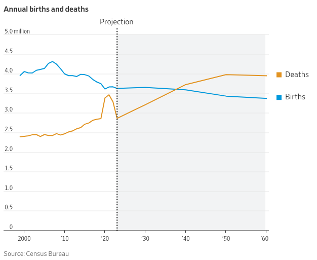
Lets go back to the population pyramid for the US. The below animation shows how it’s changed over time—especially during the Baby Boom of the 1950’s and 1960’s.
The chart below shows the most current snapshot. As you can see, the younger cohorts (ages 0-4, 5-9, 15-19, etc…) are smaller than the older cohorts up to ages 30-34.
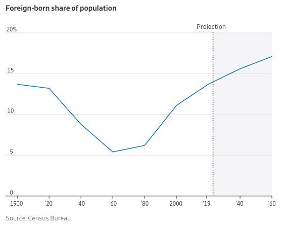
It’s for these reasons, and others (like goodwill), the US allows immigration—which is metaphorically “birthing” older people.
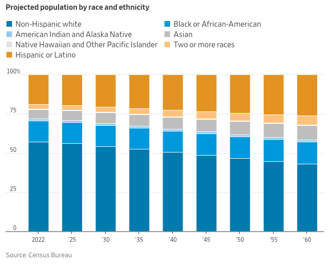
That WSJ article provides the following infographics to show how immigration will impact the US over the coming years:
So, the question isn’t “Should we allow immigration?”, but instead, “How many people do we allow to immigrate?”, “Who do we allow to immigrate?”, and “What rules do we establish for assimilation?”
The first question, “How many?”, is easiest to define because we have data showing us, across a number of areas—like economics—how many people are needed to sustain our population (after births and deaths). But, economics is not the only factor at play. This then leads to the more difficult questions of “Who?” and under “What rules"? And that is something we’ll have to save for another post.
Another option, of course, is to have more babies.
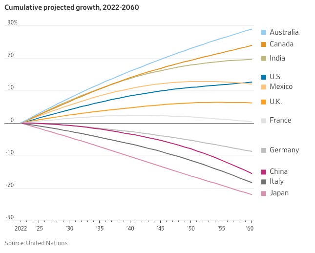
To wrap up, here’s a chart from the WSJ comparing the future projected growth of select countries. As you can see, one take-away is that India is on the rise, as China is on the decline.
Alas, running a country is difficult—a constant tension between today and tomorrow, where to apply resources, how to define a national identity, and much more. Monitoring and massaging the nation’s population size is just one component to that craziness.
I hope you found this article informative. If so, feel free to leave a comment, share with others, or subscribe—if you don’t already.